In today’s dynamic world of data analysis, an increasing number of companies are leveraging interactive dashboards for decision-making. Established Business Intelligence (BI) platforms like Tableau and Power BI are being widely used for creating complex dashboards and reports, but with the advent of the Python and the Streamlit framework, there is a new challenger that is gaining popularity among data professionals. Streamlit is a powerful alternative to traditional BI tools as it stands out for creating powerful, easy-to-use, and customizable dashboards.
What is Streamlit?
Streamlit is an open-source Python library which is designed to help data scientists and Machine Learning (ML) engineers create interactive web applications with minimal effort. It enables the development of beautiful, data-driven applications by writing only a few lines of code. While Streamlit was initially designed to showcase ML models, it has evolved into the go-to solution for rapid development and deployment of interactive dashboards.
The beauty of Streamlit lies in its simplicity. Data professionals only have to write Python scripts, and the application will render the User Interface (UI) automatically based on the code, without the need for front-end skills or complex configurations.
Let us consider the example of a business analyst who wants to create a waterfall chart that shows the contribution to the growth or dip of various metrics and provides a comparison across different dimensions. Creating this dashboard in Tableau will be difficult as the business analyst wants to showcase different timeframes and needs to select any timeframe and window to compare etc. Here, Streamlit can be used instead of Tableau.
Comparing Streamlit with Tableau and Power BI
- Ease of Use and Customization
If you already know Python, you don’t need to learn a new language or platform to use Streamlit. You can simply import your datasets, write your Python code, and the dashboard will be created. You’re free to use libraries like Pandas, Plotly, Matplotlib, and Seaborn for data analysis and visualizations. The customization is as flexible as Python itself.In comparison, while Tableau offers a user-friendly drag-and-drop interface, it requires you to learn its own set of rules, functions, and visualizations. Customization can be a bit tricky as it requires knowledge of Tableau’s proprietary language – Tableau Calculations. Power BI, like Tableau, is user-friendly but follows a more structured approach to dashboard development. Customizing Power BI dashboards can be complex if you need advanced visualizations or specific behavior.
- Cost Efficiency
Streamlit is open-source and free to use. You only pay when you want to deploy your application at scale using Streamlit Cloud or other cloud platforms. Even then, pricing is reasonable as it is a one-time cost and does not involve recurring fees for every user.In comparison, Tableau offers a subscription-based model that can get quite expensive for organizations that need to deploy BI applications at scale. Their costs include licenses for desktop, server, and online tools. Power BI comes with relatively affordable options, but once your business requirements exceed the limits of the free version, you will need to pay for Power BI Pro, which has a monthly fee. Power BI Premium, which is designed for larger organizations, can be quite expensive, as well.
- Flexibility and Control Over Visualizations
With Streamlit, you can integrate nearly any Python library, from Plotly for interactive plots to Seaborn for statistical visualizations. Additionally, you can easily customize visualizations or create new ones from scratch using code. The range of possibilities is virtually endless.In comparison, while Tableau offers a wide array of built-in visualizations, you are limited to the types and configurations of visualizations that it provides. Enabling custom visualizations can be complex and require advanced Tableau skills or even third-party tools. Power BI offers a suite of pre-built visualizations and supports custom visuals. However, the process of creating these custom visuals can require extensive coding and is less seamless than with Python-based libraries.
- Integration with Python Ecosystem
For data scientists, integration with Python is paramount. Streamlit allows seamless integration with the Python ecosystem, which means that it works directly with:- Data analysis libraries like Pandas and NumPy
- Machine Learning libraries like Scikit-learn and TensorFlow
- Visualization tools like Plotly, Matplotlib, and Altair
In comparison, Tableau doesn’t offer direct support for Python. Though it does support Python through integration with TabPy (Tableau’s Python integration service), it’s not as seamless as Streamlit and can involve additional steps for setup. Power BI has Python and R integration, but its usage is limited when compared to Streamlit. The Python scripts used in Power BI are not as easily editable or interactive as Streamlit’s dynamic Python code.
- Speed of Development
With Streamlit, you can prototype a dashboard in minutes. The ability to modify the code on the fly and instantly view changes makes Streamlit ideal for rapid iterations. It is easy to build, tweak, and update dashboards as your data or required insights evolve over time.In comparison, while Tableau’s drag-and-drop interface helps speed up initial development, advanced customization and integration with external data sources can be time-consuming. Power BI also enables quick dashboard creation but requires time to master its feature set. Integrating complex calculations or automating tasks may involve additional effort.
- Deployment and Scalabilityt
When considering deployment, Tableau and Power BI have cloud-based options, but Streamlit offers an easy, scalable solution for developers. You can deploy your dashboard via Streamlit Cloud or host it on any cloud platform like Amazon Web Services (AWS) or Google Cloud Platform (GCP). You can also containerize it with Docker, ensuring that it’s scalable and flexible.In comparison, Tableau’s cloud solutions are robust, but they can become costly with scaling. The Tableau Server option also requires significant setup and maintenance. Power BI’s cloud service is designed for scalability but organizations may face issues with data refresh limits and storage.
Streamlit in Action: Simple Example
To showcase the simplicity and power of Streamlit, let’s look at a basic example of building a dashboard.
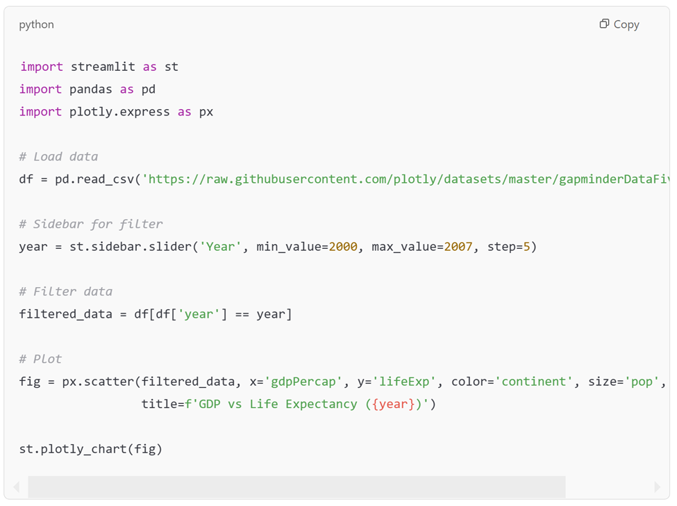
Below is the dashboard output for the GDP vs Life Expectancy.
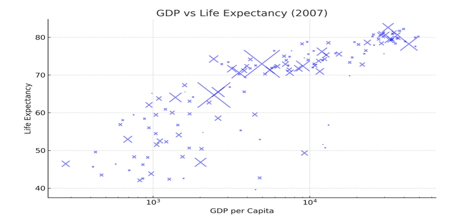
With just a few lines of Python, this simple application creates a dynamic scatter plot of GDP vs Life Expectancy, which updates based on a slider for different years. This is the kind of fast, interactive development that Streamlit makes possible.
Conclusion
In the ongoing debate of Streamlit versus Tableau versus Power BI, the decision of which BI tool to go with largely depends on the organization’s specific needs. For businesses or teams that need out-of-the-box, user-friendly tools, Tableau and Power BI remain well-proven options that can be chosen.
However, if your goal is to create a fast, interactive dashboard while leveraging the power of Python for analysis, Streamlit is hands-down the best option. It is free, highly customizable, allows full control, provides ease of integration with Python and most importantly, is designed with data science in mind.

Analytics professional with 8+ years of experience in analytics across retail and e-commerce. Outside work, I like to cook, bake and go for nature walks.